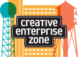
The CEZ's new logo and how it grew
The Creative Enterprise Zone's new streetscape logo came from a collaboration this past winter, a process led by Triangle Park Creative. The firm specializes in brand identity and design for nonprofit and co-ops, and it recently moved its offices from Minneapolis to the CEZ. Although they work with wide-ranging clients nationwide, some are based here in the Zone: the Higher Education Consortium for Urban Affairs, Jewish Community Action, Metro Regional Arts Council, Shared Capital Cooperative, Jewish Community Action, the Patrick and Aimee Butler Family Foundation, and Shared Capital Cooperative, among others. Its founder, Dan Nordley, has deep roots in the co-op movement and the Twin Cities nonprofit and neighborhood newspaper communities. The company's tagline says it: "Design for a better world."
What goes into developing a logo? As John describes it, it starts with listening, research, and discovery. Last fall Dan and John met with a small committee of the CEZ board, which was authorized to collaborate and eventually bring a final design for full board consideration. Over several sessions, the team discussed the Zone's mission and previous visual branding, and also the area's history: its geography, its inhabitants over time, and its current mix of people and enterprises. To arrive at a general tone, John asked some playful questions, too: If the CEZ were a dog (shoe / movie / work of art), what would it be? He asked the group to bring other logos and visuals to a session called "Like This / Not Like This." While the logo process is intuitive, designers use exercises like these, as well as research, to get at the essence of the organization, and its aspirations.
One team member shared a photo of a warehouse nameplate, typical of early-1900s industrial areas. On brick exterior walls, building names were painted in white on a black field with a narrow white border. Two local examples: at Carlton Place Lofts— a former liquor warehouse— the "2295 Building" nameplate is still visible at the roofline. And on Wabash just east of Vandalia, "Superior Packing" can be seen on the former meat-packing plant. John decided to draw on that signage history for the logo lettering treatment.
By midwinter, John had seven logo concepts to show the group. The streetscape was one; others were based on interlocking gearwheels, shipping crate labels, wrought iron, and other images (and type treatments). All were appealing; all had the requisite grit and energy. But in this case, consensus was quick: everyone gravitated to the streetscape with the nameplate lettering.
Now the narrowing-down phase began. After some discussion, they agreed on three buildings to depict: the KSTP tower, Seal Hi-Rise, and Vandalia Tower. Not only are they iconic shapes, they suggest a lively panorama from west to east. John refined the images and chose the font, which can be trickier than it sounds. As a guide, he used a Designall typeface, which mixes upper and lower cases for a dynamic, inclusive tone. But for the final typographic art he used one of the DIN font families (the inspiration for Designall), dating back to mid-1900s German road signs. But even then, tweaks were needed. For reasons of both style and readability, John said, "I created a new T and redesigned the A and E."
Colors came next: the team found that the turquoise, gold, and coral worked well together, as did their overlap colors. They also agreed on a secondary palette to use when needed: periwinkle, rust, and machine gray.
When the CEZ board saw the final logo in February, it was pretty much love at first sight. Just one question remained: should we add the crescent moon to the silhouette of Vandalia Tower? The vote was unanimous.
"John's process helped us define our purpose and express it in a visual language we can share with the world," said committee member Julie Ann James. "Our new identity springs from our neighborhood and our mission. Through the partnership with Triangle Park, something meaningful and beautiful came into being. Awesome!" The logo had a soft launch this spring. Join us June 13 to toast the official rollout!
Pictured: Dan Nordley (left) with creative director John Seymour-Anderson in TPC's Baker Building offices. The painting by Janice Perry Porter shows the firm's roots in the Seward neighborhood, overlooking Triangle Park.


